Why does a car rental company need a corporate design and what needs to be considered?
In today’s competitive world, it is essential for any business – including car rental companies – to have a strong corporate identity. This identity not only defines the visual appearance, but also encompasses corporate communication and corporate culture. Together, these elements form the overall picture and are decisive for the perception and long-term success of a company.
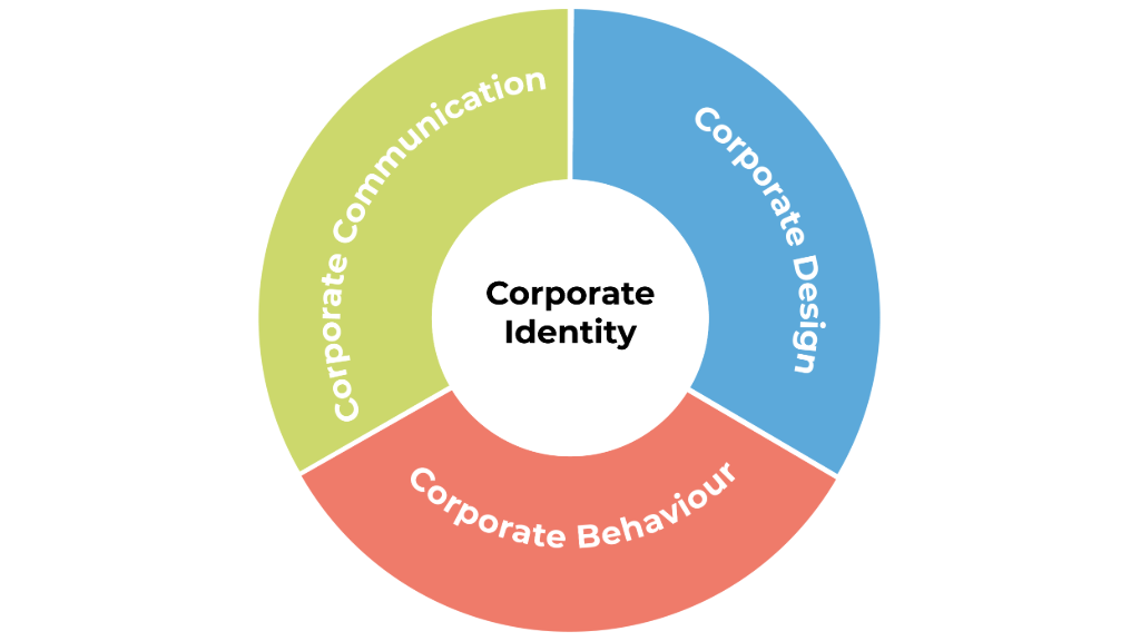
A well thought-out corporate design (CD) is a central component of this corporate identity. Your customers cannot not identify with companies, they identify with faces. The corporate design is the face of your company. When you think of big brands, you probably first think of visual elements, such as the logo or the colors. A good corporate design helps therefore car rental companies to stand out from the competition, retain customers and convey a consistent brand image. In this article, you will find out which aspects you should consider when developing a strong corporate design.
Logo: The heart of your brand identity
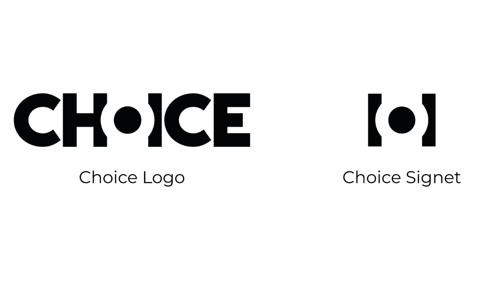
A strong logo is the heart of the corporate design. It represents the brand at first glance and should therefore be concise and meaningful. Make sure that your brand name is easily recognizable, but also that it is easy to read. For brands that are still unknown, the logo should discreetly explain what your company does. You can achieve this, for example, with a small slogan under the logo or a meaningful image in the logo (the so-called signet). Berit Garbrecht, our Head of Marketing, explains what was taken into account when creating our logo: “With our logo, particular attention was paid to the legibility of the brand. With the smaller O, we have an element that has a high recognition value. It may also remind some people of the rounding of car tires, whereby we demonstrate the mobility aspect of our brand. With the latest adaptation of our corporate design, we wanted to create an additional element that could be used in addition to the logo to give a more discreet indication of our brand without always having to use the entire logo,” explains Berit. The signet is an excerpt from our logo and stands for mobility: the circle symbolizes mobility, while the two bars represent our Mobility Partnership and mobility-OS products. “We particularly like to use it when there is not enough space to use the full logo or when we want it to be less noticeable,” says Berit.
Typography and color choice: How your brand communicates visually
Choosing the right typography is is crucial for communicating the personality and values of a company. For your business stationery, you should choose fonts that reflect the identity of your brand. It is important to consider suitable fonts for all media, the body text in brochures and on your website as well as for decorative purposes. Typography should be clear, legible and consistent across all communication channels. Ideally, the selected font should match your logoto convey a uniform image.
Colors are much more than an aesthetic tool – they convey emotions, values and moods. When Berit Garbrecht, our Head of Marketing, took up her position at Choice AG, the corporate design was in a state of upheaval. Choice’s designs used to thrive on color and variety, but over the years these have been reduced, resulting in a black and white look. Berit realized that important elements were missing and that the design no longer reflected the colorful diversity and different characters of our company. “A corporate design is the face of a brand, while the company values represent its personality,” emphasizes Berit. But this personality should also be reflected in our colors reflected in our colors. “People should be able to identify with our brand.”
To achieve this, Berit initiated a creative process. It is often useful to ask which colors people prefer in order to find out which colors suit a person. These preferences are often defined by seasons. Berit asked her colleagues the question: “What season would Choice AG be if she were one?” The answer was clear: a late spring, which embodies a positive attitude because people are looking forward to summer. “We feel this as a company and work together to grow,” she explains. “These answers inspired me. I chose a picture of a spring landscape and extracted the colors from it to develop our new color palette.” Blue stands for reliability, green symbolizes respect and terracotta represents energy. These colors are the visual heart of our new design.
This story is intended as an example of how you can arrive at your individual corporate colors. Of course, you can also choose the perfect corporate colors in other ways. However, it is advisable to pay attention to the color theory here. People associate different emotions with different colors. While red is often perceived as aggressive, yellow, for example, is a rather calm, balanced color. Think about how you want your brand to come across and adapt your colors accordingly.
Style guide as the key to uniform brand communication
A Corporate Design Styleguide is an indispensable tool that ensures that all visual elements of your brand are used consistently and uniformly. It serves as a comprehensive guide for the design of communication materials and helps to maintain brand identity across all channels. The style guide defines how the logo, typography, colors and other design elements should be used correctly. It includes detailed instructions on the use of fonts, color palettes and layouts to ensure that all materials reflect the brand values and desired aesthetic.
A well-thought-out style guide not only provides clear guidelines, but also the necessary space for creative development. While a design that is too superficial can offer freedom, there is a danger that it can be restrictive if you don’t dare to design new things for fear of losing consistency. A balanced style guide, on the other hand, makes it possible to be innovative within the defined framework while maintaining brand integrity.
In addition, a detailed style guide promotes efficiency in the design process. It reduces the need for repeated coordination and corrections, as everyone involved can access a common visual language.
Touchpoints: Consistency in stores and online
Touchpoints are all places and opportunities where customers come into contact with a brand. This applies to the car rental industry as well as other sectors. These contact points can take place online, via booking platforms and customer portals, as well as in the car rental company’s physical branches. A uniform design at all these touchpoints is crucial to strengthen the brand’s recognizability, create trust and convey professionalism.
Especially when building up a branch network, it is important that customers experience the same recognition value in every branch. A well-defined corporate design helps to consistently implement the design specifications – be it in the design of the branches or the digital user interfaces. This ensures that customers have the same positive brand experience everywhere.
Corporate design as a competitive advantage for your car rental company
A strong corporate design is more than just an aesthetic aspect; it is a strategic tool that conveys the identity and values of your car rental company to the outside world. By carefully selecting the logo, typography and colors, you not only create a uniform and appealing appearance, but also an emotional connection to your customers. Overall, a strong corporate design helps to strengthen the brand identity and ensure long-term success. secure.